Power Apps: Hidding and showing a component

I was tasked with developing a canvas app for a client that required each screen to include a popup element. The popup needs be openend by clicking an image, upon being clicked, it triggers a popup screen where users can compose a message. I utilized a Library Component and explored methods to control its visibility effectively. The challenge was ensuring that the message popup would appear when an image is clicked and disappear upon user interaction with a designated button. My solution involved manipulating the component’s dimensions — adjusting the height and width to expose only the image or to reveal the entire component. This technique successfully creates the perception of the popup screen being opened and closed by the user.

  • The first step is to create a solution with a canvas app and a component library.
  • In my example I named the component comp VIM Message.
  • Then open the component.
  • Set the size of the component to 640 by 640.
  • Add two custom output properties to the component named CompVIMHeigt and CompVIMWidth.
  • Set the component width to ‘comp VIM Message’.CompVIMWidth
  • Set the component height to ‘comp VIM Message’.CompVIMHeight
  • Set the component reset to Set(varCompHeight, 80);
  • Add an image element and set the following code on the Onselect. This will make the container visible and make the component bigger.
Set(varComVIMVisible, true);
Set(varCompHeight, 640);
Set(varCompWidth, 640);
  • You might need to adjust the numbers based on your needs.
  • Also set the X and Y properties on your image based on your needs. I use the following.
X = 'comp VIM Message'.Width - 55
Y = 15
  • Add a container with the element you need in the popup.
  • Set the following properties of the container.
Visible = varComVIMVisible
Height = 440
Width = 520
X = 75
Y = 190
Visible = varComVisible
  • Add two buttons in the container one called Cancel (in Dutch that would be Annuleren) and Send (in Dutch that would be Verzenden).
  • Set for both button the onselect to the following code, this will make the component smaller and hide the container.
Set(varCompHeight, 80);
Set(varCompWidth, 60);
Set(varComVIMVisible, false);
  • Open the canvas app and add the component comp CIM Message.
  • Insert the component into the canvas app.
  • Set the Heigth property to the following code. This will make sure the Height has a value when the canvas app page is loaded.
If(IsBlank('comp VIM Message_HS'.CompVIMHeight), 80, 'comp VIM Message_HS'.CompVIMHeight)
  • Set the Width property to the following code. This will make sure the Width has a value when the canvas app page is loaded.
If(IsBlank('comp VIM Message_HS'.CompVIMWidth), 60, 'comp VIM Message_HS'.CompVIMWidth)
  • Set the X property to the following code. This will make sure that the Image part of the component is on the left top side of the screen.
If('comp VIM Message_HS'.CompVIMWidth = 640, 'Home Screen'.Width - 640, 'Home Screen'.Width - 60)
  • Now run the canvas app and see if it works (it might not work in the play function in the edit mode).

From Bing Maps to Azure Maps

Bing maps has been an easy-to-use solution for getting location information in canvas apps, but this offering will be placed under the Azure Maps umbrella. While Bing Maps will continue to function for now, it’s essential to prepare for the transition. In this blog post I will explain how to use Azure Maps in a Canvas App. Please note that the locations shown in this post are not my actual location.

Azure Maps Services

  • First, we need to create a Azure Maps Account in a resource group (I will presume you know how to create a resource group).
  • Open your resource group.
  • Click on Create and search for and click on Azure Maps.
  • Click on Create.
  • Give the Azure Maps Account resource a name.
  • Select the correct Region and Pricing tier.
  • Agree with the terms and click on Review + Create.
  • Click on Create and wait for the deployment to be ready.
  • Click on Go to resource.
  • Click on Authentication and copy the Primary Key. You will need this in the Power Automate Flow.

The Power Automate Flow

  • Create a new Power Automate Flow and name it Azure maps get Postal Code.
  • Add as the trigger Power Apps (V2), with two text inputs called Longtitude and Latitude.
  • Next, we will add a HTTP action, this will call Azure Maps to get the location details based on the provided GPS location.
  • Set the method to Get.
  • Set the URI to the following code, make sure to put in your subscription-key (that is the primary key from the Azure Maps Account resource).
  • Set the Latitude and Longitude with the input fields form the trigger.
https://atlas.microsoft.com/search/address/reverse/json?api-version=1.0&subscription-key={YOUR KEY}&query={Latitude},{Longitude}
  • Add the action Parse JSON and give it the name Parse JSON – Location information.
  • Set the Content to the body of the HTTP call and set the schema as detailed in the linked file.
  • Add a compose action (if you want to only return the first found postal code).
  • The code for the input is as follows if you have named the Parse JSON action the same as I did.
first(body('Parse_JSON_-_Location_information')?['addresses'])?['address']?['postalCode']
  • Add the Respond to a Power App or flow action.
  • Add an output text called postalcode and add the compose as its value.
  • Your flow will now look like this.

The canvas app

We will now create the canvas app with a map that shows the user’s current location on a map, and a button to get the postal code of that location and a reset button. Please note this is not my actual location.

  • Create a new canvas app, I blank Phone canvas.
  • Click on Power Automate followed by Add flow to add the earlier created flow.
  • Add the map element to the canvas app.
  • Set the DefaultLatitude property with the following code.
Location.Latitude
  • Set the Location.Latitude property with the following code.
 Location.Longitude
  • Set DefaultLocation property with the following code.
true
  • If you want to see your Latitude and Logitude you can add labels to display the values.
  • Add a Label and set the Text property with the following code.
"Latitude: " & Location.Latitude
  • Add a Label and set the Text property with the following code.
"Longitude: " & Location.Longitude
  • Add a button and set the Text property with the following code.
"Get postal code"
  • Set following code on the OnSelect property. If needed update the code with your flow name, I used AzuremapsgetPostalCode.
Set(varPostalCode,AzuremapsgetPostalCode.Run(Location.Longitude, Location.Latitude));
  • Add a button and set the Text property with the following code.
"Reset"
  • Set following code on the OnSelect property.
Set(varPostalCode, Blank())
  • Add a label and set the Text property with the following code.
"Postal Code: " & varPostalCode.postalcode

Power Pages: Prefill fields with data form the user profile

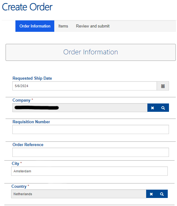
Microsoft Power Platform provides powerful tools for creating web portals, and Power Pages is one of them. In this blog post, we’ll explore how to enhance the user experience by pre-filling order forms on your portal using custom fields. Specifically, we’ll focus on pre-populating the order form with data from the user’s profile page.

Imagine you have a Power Pages website with an order form. Users need to fill out details such as their city and country and other relevant information. To streamline this process, we’ll leverage custom fields you’ve added to the user’s profile page. When a user accesses the order form, we’ll automatically populate these fields based on their profile information.

Adding fields to the Profile

  • Add the required fields to the Contact and Order table in Dataverse
  • For example, a text field called City and a lookup field called Country.
  • Add the fields to the form Profile Web Form, which is the default form used in the Power Pages profile page.
  • Open the Power Pages website to see if the changes are visible and fill them.

JavaScript to prefile the columns on a order

  • Open the Portal Management of your Power Pages website.
  • Open the element where you need to prefill the fields. In my case it’s the Order Information Web Form Step that is part of the Create Order Web form.
  • On the tab Form Options (this can be different per element) and navigate down to the Custom JavaScript input box.
  • Add the following code and change the following if needed.
$(document).ready(function() {

    //Get the profile county ID and Name data
    var CountryGUID = "{{ user.abc_country.id }}";
    var CountryName = "{{ user.abc_country.name }}";    
  
    //Get the City from the users profile (contact table)
    var City = "{{ user.abc_city }}";
  
    //set the text input element city with the profile field City
    document.getElementById("city").value = City;

    //set the lookup input element with the profile field Country
    //Set the name of the lookup field
    $("#abc_country_name").attr("value",CountryName);
    //Set the GUID of the lookup field
    $("#abc_country").attr("value", CountryGUID);
    //Set the logical name of the lookup table
    $("#abc_country_entityname").attr("value","abc_country");
});
  • Open the page in a web browser and use the web developers tools (f12) to find the id of the city field.
  • Update the document.get ElementById if required.
  • Do the same thing for the #abc_country_name, #abc_country and #abc_country_entityname.
  • Update the $(“”).attr where required.
  • If you are using different field names make sure to update the field names or add them to JavaScript.
  • {{ user.[fieldname] }} will return the value of that field.
  • {{ user.[fieldname].id }} will return the id of the selected value of a lookup field.
  • {{ user.[fieldname].name }} will return the name of the selected value of a lookup fields.
  • Save the changes and your fields will now be filled automatically.

Enhancing Dynamics 365 Supply Chain Management Customer Portal: Adding Editing and Deleting Functionality to Orders

Within the Dynamics 365 ecosystem, the Customer Portal serves as a gateway for clients to interact with your organization and order products. While the default template for Power Pages/Portal facilitates order creation and product management, it falls short when it comes to allowing users to edit or delete existing orders and products.

In this blog post, we embark on a journey to enhance the functionality of the Dynamics 365 Supply Chain Management Customer Portal. We’ll focus specifically on empowering users with the ability to edit and delete orders and products, providing them with greater control over their transactions.

By default, there is no option to go to orders that are not submitted, so I added the a page to see the draft orders.

Besides adding the draft order view, I renamed other tiles and a link to the create order page.

Order editing

I will assume that you already have a Power Pages setup with the Supply Chain Management Customer Portal template and that you know how to add a new page named Draft Orders with a view and how to make a tile. I will go straight into how to add the capability to edit an order and its products.

  • Add a new page called Update Order to the Portal.
  • Open the Draft Orders page and select the Edit Record option under List settings – Actions.
  • Select the newly created page Update order and give it the name Update Order.
  • The Target type is Webpage.
  • Then open the Portal Management tool to create the Web Form. A web form is a form with multiple steps.
  • Open the already existing Web Form called Create Order.
  • Open a new tab and create a new Web Form called Update Orders.
  • Setup the Update orders Web form exactly the same as the Create order Web form.
  • Under Web Pages add the existing page called Update Order.
  • Open the Update Order page to make sure the Web Form property is set to the newly created Update Orders web form and the Publishing State is Published.
  • Reopen the Web Form and open the Web Form Steps tabs.
  • Create four new web form steps equal to the steps in the create order web form.
  • Some of the settings cannot be set in the user interface. You will have to open the table adx_webformstep in Dataverse to make sure all the settings are the same.
  • Now that the steps are the same, we are going to make the following changes to them.
  • Open the step Items and set under Form Definitions the Mode to Insert.
  • Reconfigure the Source type to Results From Previous Step
  • Reconfigure the Entity Source Step to Order Information.
  • Open the tab Metadata under and create a new Subgrid
  • Select the Type Subgrid
  • Selected the salesoderdetailsGrid
  • In the Grid Configuration we will add the buttons for Edit, Delete and Add item.
  • Click on Create in the View Actions section to create the following action.
  • Create the delete action in the Item Actions section.
  • Create the view details action in the Item Actions sections.
  • Open the step Order Information and set under Form Definitions the Mode to Edit.
  • Reconfigure the Source type is Query String
  • Reconfigure the Primary Key to ID, if it changed.
  • Reconfigure the Name to Order (Salesorderid), if it changed.
  • You have now created the web form for your users to enjoy!

Power Pages: Tracking clicks and downloads

Knowing how your external users are using you Power Pages is very important. Especially if you are sharing import documents through the Power Pages. In this blog post, we will show you how to set up a Power Page with a script that monitors the downloads and stores this data in Dataverse. By leveraging this functionality, you can gain valuable insights into user behaviour, track file downloads, and make data-driven decisions.

This solution was created together with my colleague Rik de Koning who speaks regularly at Power Platform events.

Power Pages configuration

Before we can save data to the Dataverse with a JavaScript we need to configure the Power Pages to allow the web api access. You need to configure the first 2 settings for each Dataverse table where data needs to be stored.

  • Open the Portal Management of your Power Pages.
  • Go to Site Settings
  • Here you need to add three settings.
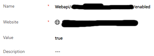
  • The first setting is to enable the web api on your Dataverse table.
    • Name: Webapi/[table logical name]/enabled
    • Website: Select the website
    • Value: true
  • The second setting is to allow the web api to access the fields
    • Name: Webapi/[table logical name]/fields
    • Website: Select the website
    • Value: cre9b_userid,cre9b_document,cre9b_username,cre9b_dateandtime
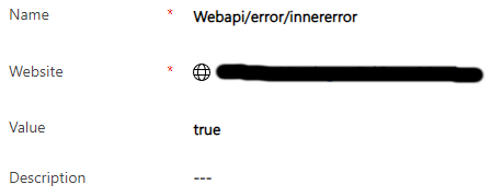
  • The third setting is to allow for errors to be displayed.
    • Name: Webapi/error/innererror
    • Website: Select the website
    • Value: true

The JavaScript

In our example we created a button that both downloads a document (note with an attached file) and creates a new record in a Dataverse table. The api call to create the record is added as a onclick event on the button, while the href is linked to the actual document. The JavaScript itself needs to be added on the content page linked to the Information page. If you have another use case please look at the details of the Portal Web API on Learn Microsoft.

  • Open the Portal Management and open the Web Pages
  • Open the Information page where the JavaScript needs to be added.
  • Open the related Content page.
  • First you will need to add the Wrapper AJAX function, this will give you the function safeAjax to use the web api.
(function(webapi, $){
    function safeAjax(ajaxOptions) {
        var deferredAjax = $.Deferred();

        shell.getTokenDeferred().done(function (token) {
            // add headers for AJAX
            if (!ajaxOptions.headers) {
                $.extend(ajaxOptions, {
                    headers: {
                        "__RequestVerificationToken": token
                    }
                }); 
            } else {
                ajaxOptions.headers["__RequestVerificationToken"] = token;
            }
            $.ajax(ajaxOptions)
                .done(function(data, textStatus, jqXHR) {
                    validateLoginSession(data, textStatus, jqXHR, deferredAjax.resolve);
                }).fail(deferredAjax.reject); //AJAX
        }).fail(function () {
            deferredAjax.rejectWith(this, arguments); // on token failure pass the token AJAX and args
        });

        return deferredAjax.promise();	
    }
    webapi.safeAjax = safeAjax;
})(window.webapi = window.webapi || {}, jQuery);
  • You can now add a function to the script that gathers the required information and send that to the safeAjax funtion. The safeAjax function then executes the api call.
function openfile(url) {
	var nowDateTime = new Date();
	var username = "{{ user.fullname }}";
	var contactid = "{{user.contactid}}";

    webapi.safeAjax({
		type: "POST",
		url: "/_api/[tablename]",
		contentType: "application/json",
		data: JSON.stringify({
			"cre9b_userid": contactid,
			"cre9b_document": url,
			"cre9b_username": username,
			"cre9b_dateandtime": nowDateTime
			
		}),
		success: function (res, status, xhr) {
      //print id of newly created table record
			console.log("entityID: "+ xhr.getResponseHeader("entityid"))
		}
	});
}
  • You can use the {{ user.[column] }} to get data out of the contacts table.
  • url is not a default options, I created a variable in a different part of the JavaScript.

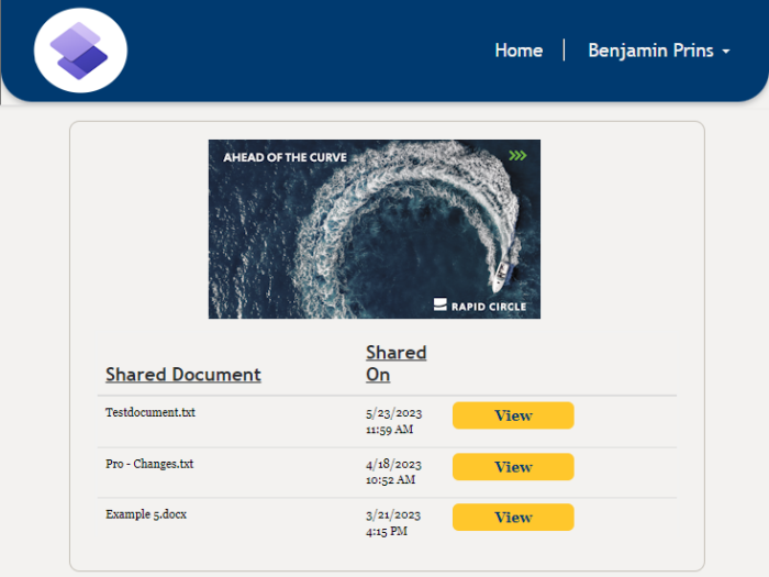
For everybody that is interested in how we added the buttons I have added that code as well. With a JavaScript we created a button for each file (note) by changing the URL column into a button.

$('.entitylist').on("loaded", function () {
    // this will get the index of the corresponding table header
    var columnindex = $('th:contains("URL")').index();
    // this will loop through each table row below the corresponding table header
    $('tr').each(function () {
        var column = $('td', this).eq(columnindex);
        if (column.text().includes("https://")) {
            // this will find all a attributes based on the document links link
            const documentLinks = document.querySelectorAll(`[href="${column.text()}"]`)
            documentLinks.forEach(documentLink => {
                // this will set the className and the text of the link accordingly
                documentLink.className = "btnViewDocument"
                documentLink.target = "_blank"
                documentLink.text = "View"
                documentLink.onclick = function() { openfile(documentLink.href);};
            });
        }
    });
    // this will clear the name of the corresponding table header
    document.querySelector(`[aria-label*="URL"]`).innerHTML = ""
    document.querySelector(`[aria-label*="Created On"]`).innerHTML = "Shared On"
});

Add Power Fx buttons to model-driven apps

Model-driven apps, a fundamental component of the Power Apps suite, provide a robust framework for designing data-driven solutions. While they offer a wealth of functionality out of the box, adding customized actions and automations can greatly enhance the user experience and boost operational efficiency. This is where low-code Power Fx buttons come into play, providing a simple yet effective way to empower users to take control of their apps and automate routine tasks.

In this blog post, we will delve into the world of low-code development and explore how you can leverage Power Fx buttons to supercharge your model-driven apps. We’ll walk you through the process of adding a button that when pressed will save data in Dataverse.

Creating a Power Fx Button (command bar button)

  • Open your Model-driven app in edit modus.
  • Select … of the table (entity) where you need to add the button.
  • Click on Edit or Edit in new tab under Edit command bar.
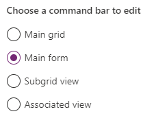
  • Select the command bar that where the button needs to be added, in my case that is the Main form.
  • Click on Edit and the command bar will be loaded.
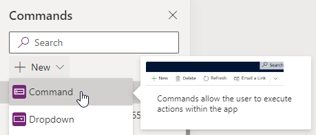
  • Click on New followed by Command to add a new button.
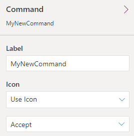
  • Change the label (name) of the button and place (drag) it to the correct location on the command bar.
  • If required select an Icon, selecting an icon help the user with recognizing the button and its function.
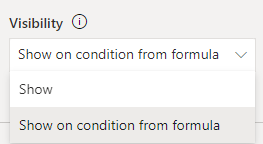
  • With the help of Power Fx code we can add when the button will be displayed (visible). For example; Only show the button when the the color field has the value Green.
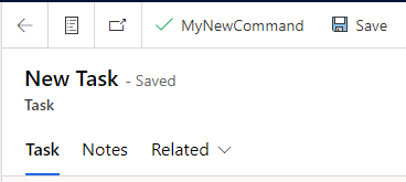
  • Select the Show on condition from formula on the Visibility property.
  • Click on the Open formula bar, that appears below the property.
  • Add your Power Fx command that dictates when the button needs to be displayed.
If(Self.Selected.Item.color = "Green", true, false)
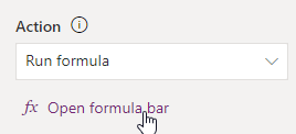
  • Click on Open formula bar under the Action property to add the Power Fx code that needs to be executed when the button is pressed.
  • Add your Power Fx command that needs to be executed, in my example it set the color field value to Purple.
Patch(Tasks,Self.Selected.Item, {color:"Purple"});
  • Click on Save and Publish when the button is ready.
  • Play the Model-driven app to see if the button is working correctly.